
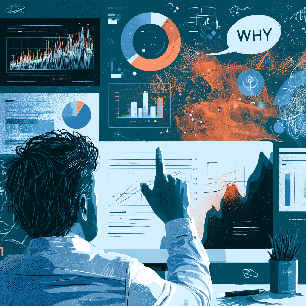
Analytics tells you what happened — how many people visited, where they landed, where they left. It almost never tells you why. You can see that 70% of visitors abandon a page and still have no idea what drove them away. Heatmaps and session recordings fill exactly that gap: they show you how people actually behave on your pages, turning a mysterious drop-off number into an observable behaviour you can fix. This piece is about using these tools to see what analytics can’t, and using them well.
The what-versus-why gap
Quantitative analytics is excellent at the what and silent on the why, and that silence is where most conversion problems hide. A high exit rate on a page is a fact; the reason behind it is a question analytics can’t answer. Heatmaps and session recordings are how you turn “people leave this page” into “people leave because they never see the button below the fold.” They convert a number into an explanation, and explanations are what you can act on. Without them, you’re left guessing at causes, and guessed-at causes lead to changes that miss the real problem.
This is why behavioural tools pair so naturally with analytics: analytics finds the where, behavioural tools reveal the why, and together they point at a fix.
What heatmaps show
Heatmaps aggregate the behaviour of many visitors into a visual overlay of a page, revealing patterns no single visit would show.
- Scroll maps show how far down the page people actually get — often revealing that the call to action you placed near the bottom is seen by almost no one, because most visitors never scroll that far.
- Click maps show where people click — including clicks on things that aren’t links (suggesting they expected something to be clickable) and the absence of clicks where you hoped for them.
- Attention maps show where people linger, revealing what draws the eye and what gets ignored entirely.
The value is in the surprises. Heatmaps routinely show that visitors ignore the thing you thought was central and fixate on something you considered minor — gaps between your assumptions and reality that you’d never catch by looking at numbers alone.
What session recordings show
Where heatmaps aggregate, session recordings show individual journeys — a replay of one real person moving through your site. This is the most direct window into friction you can get short of sitting beside a user. You see the hesitation before a form, the repeated scrolling up and down looking for information, the rage-clicks on an unresponsive element, the moment of confusion before someone gives up. A recording can reveal in thirty seconds a friction point that months of analytics never exposed, because you’re watching the actual struggle rather than inferring it from a statistic. A handful of recordings of people failing to complete a task is one of the highest-value things you can watch in all of CRO.
Use them to generate hypotheses, then test
Here’s the discipline that keeps these tools honest: heatmaps and recordings are brilliant for generating hypotheses and dangerous as proof. Watching ten people struggle with a form strongly suggests the form is the problem — but ten sessions aren’t a statistically reliable sample, and what looks like a clear pattern can mislead. So the right workflow is to use behavioural tools to discover what’s likely wrong and form a specific hypothesis, then validate the fix with a proper A/B test before believing it. Qualitative observation finds the problem; quantitative testing confirms the solution. Using recordings as both discovery and proof is how people convince themselves of fixes that don’t actually work.
Look with questions, not aimlessly
A practical caution: heatmaps and recordings can become a time sink if you browse them aimlessly, fascinated but learning nothing actionable. The productive way to use them is to start with a question — “why are people abandoning checkout?” — and watch with that question in mind, looking for the specific behaviour that answers it. Targeted observation tied to a real problem yields insight; open-ended watching yields entertainment. Bring a question, find the friction, form a hypothesis, test it.
The bottom line
Heatmaps and session recordings give you what analytics can’t: the why behind the what. Scroll, click, and attention maps reveal the gap between where you put things and where people actually look; session recordings show individual friction in real time, often exposing in seconds what statistics never would. Use them to generate sharp hypotheses about why visitors don’t convert, then confirm the fixes with proper testing rather than trusting a small sample. Watch with a question, and these tools turn mysterious drop-offs into problems you can see and solve.
Want help turning behavioural data into conversion fixes? Get in touch.