
A landing page has one job, and that singularity is its whole power. Unlike a homepage trying to serve everyone or a blog post trying to inform, a landing page exists to get one specific visitor to take one specific action. Most landing pages fail because they forget this — they hedge, they wander, they offer choices, they try to do everything and accomplish nothing. The high-converting ones are ruthlessly focused. This piece is the practical anatomy: what every converting landing page does, and why.
The principle: one page, one job
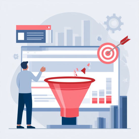
Before any tactic, internalise the governing rule. A landing page should have a single goal and remove everything that doesn’t serve it. Every element either moves the visitor toward the action or distracts from it; there is no neutral. The navigation menu offering ten escape routes, the unrelated links, the second and third calls to action competing with the first — all of these dilute the page’s purpose. The discipline of a great landing page is subtraction: stripping away everything that isn’t pulling in the same direction.
This is why landing pages outperform general pages for conversion. A homepage is a hub with many exits; a landing page is a corridor with one door. Build the corridor.
Message match: keep the promise that got them here
The most common landing page failure happens in the first three seconds. Someone clicks an ad or link expecting one thing, lands on a page that talks about something subtly different, feels the mismatch, and leaves. The page must immediately confirm it delivers what the visitor was promised — the same offer, the same language, the same intent as whatever they clicked. If your ad said “free SEO audit for Zürich businesses,” the page’s headline should say essentially that, not “Welcome to our marketing services.” Message match is the handshake that tells the visitor they’re in the right place, and breaking it is the fastest way to lose them.
This connects the landing page to whatever drove the traffic. A landing page can’t be designed in isolation; it has to honour the promise of the click that brought someone to it.
The anatomy of a converting page
With focus and message match in place, the structure follows a reliable pattern.
- A headline that states the value clearly. The visitor should understand what they get and why it matters within seconds. Lead with the benefit, not with your brand.
- A clear, specific offer. Spell out exactly what the visitor receives and what’s being asked of them. Vagueness kills conversion; specificity builds confidence.
- Proof. People hesitate to act on claims alone. Testimonials, results, logos, guarantees — evidence that others trusted you and benefited — lowers the perceived risk of acting.
- A single, obvious call to action. One primary action, stated as a clear instruction, visually prominent, repeated as needed but never competing with rival actions. The visitor should never have to wonder what to do next.
Each element answers a question in the visitor’s head: what is this, is it for me, can I trust it, what do I do. Answer all four and the page converts; leave one unanswered and it leaks.
Reduce friction and doubt
Beyond the core elements, conversion is helped by removing the small frictions and doubts that cause hesitation. Asking for less — fewer form fields, less commitment up front — lifts completion. Anticipating and answering the obvious objections, right where they arise, keeps doubt from stalling the decision. And making the page fast and clean matters, because a slow or cluttered page erodes the trust the rest of the page is building. Friction is the silent killer of conversion: every extra step, every moment of confusion, every unanswered worry is a reason to leave, and removing them is often more powerful than adding persuasion.
Test and refine
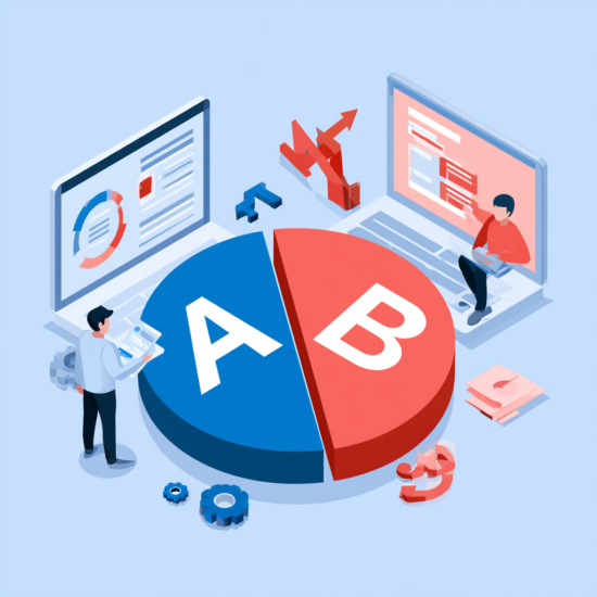
A landing page is rarely perfect on the first attempt, and the same evidence-based discipline that powers good CRO applies here. Watch how visitors actually behave on the page, form hypotheses about what’s causing drop-off, and test changes properly rather than tweaking on instinct. The anatomy above gets you a strong starting page; honest testing turns a strong page into an excellent one over time. Treat the page as a living asset to improve, not a one-time build.
The bottom line
A landing page converts when it does one job ruthlessly: a single goal with everything else stripped away, an immediate message match that keeps the promise that brought the visitor there, and a clear anatomy — value-led headline, specific offer, real proof, one obvious call to action — that answers every question in the visitor’s head. Remove friction and doubt, then refine through honest testing. Build it that way and the page turns the traffic you worked to earn into the action you actually want.
Want a landing page reviewed for why it isn’t converting? Get in touch.